How the interactive galaxy map works
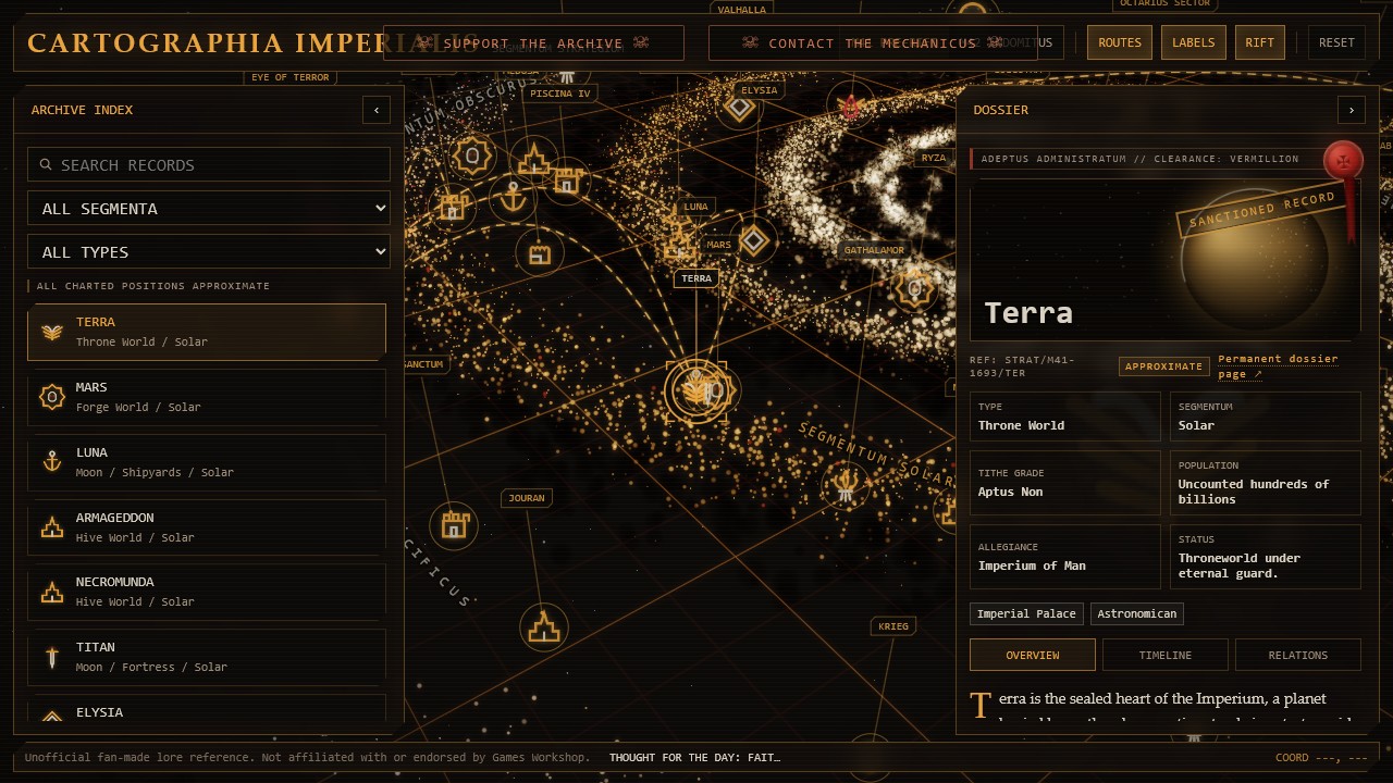
Cartographia Imperialis is a fan-made interactive map for exploring the geography and major locations of the Warhammer 40,000 setting. The map places 99 worlds, regions, rifts, and political landmarks on a navigable galactic chart rather than presenting them as a flat alphabetical list.
Drag the chart to pan, use the wheel or pinch gesture to zoom, and select a marker to open its dossier. The archive panel can also search by name and filter records by segmentum or world type, which is useful when the chart becomes crowded at a wide zoom level.
Reading segmenta, labels, and routes
The broad segmentum labels divide the Imperium into Solar, Obscurus, Pacificus, Tempestus, and Ultima. They are navigation aids rather than perfectly surveyed borders: the setting's published maps vary, and the galaxy has no single public coordinate system that resolves every location consistently.
Route lines connect selected locations that share strategically useful or narratively important paths on this chart. They are a reading layer, not a claim that every line represents one permanent, safe warp corridor. Toggle Routes or Labels from the top controls when you want a cleaner view.
World dossiers and shareable links
Selecting a marker opens a dossier with classification, segmentum, allegiance, current status, historical notes, and related locations. The permanent dossier link leads to a normal text page that can be bookmarked, shared, and read without running the 3D renderer.
Map selections also use shareable query URLs. A link such as the Cadia record can open the map at that location, while the era parameter can load the same chart in M41 or M42. This makes it possible to send someone a specific view instead of telling them where to search.
What the chart is—and is not
This project is an unofficial navigation and lore-reference tool. It does not reproduce an official Games Workshop map, and it should not be treated as a canonical distance calculator. Positions are approximate syntheses designed to make relationships legible on an interactive screen.
The most useful way to read the map is relationally: which worlds sit near the Eye of Terror, which records fall within a named segmentum, and how the Great Rift changes the strategic picture. Where published material conflicts or remains deliberately vague, the chart favors clarity and marks the uncertainty.